
Graphic Design
-

BHAPPI
Logo and Package Design
-
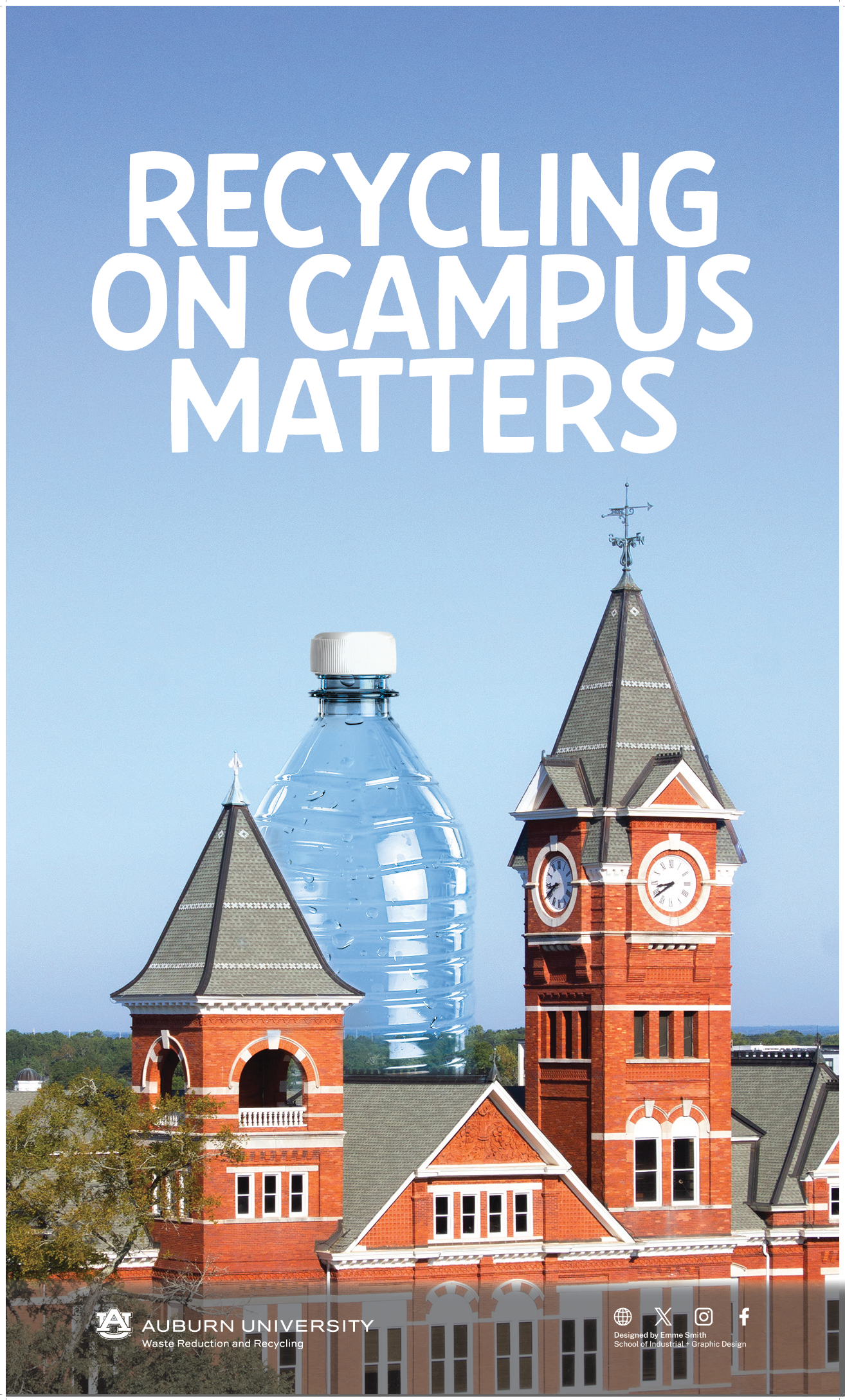
Auburn Recycling Campaign
Poster and Button Design
-

Special Edition: Mom Water
Package Design
-

Novus
Logo Design and Brand Identity
-
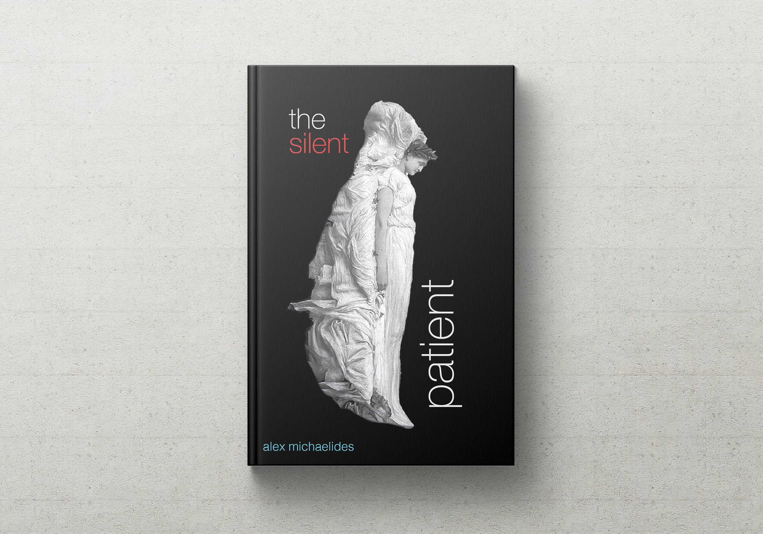
Silent Patient
Cover Redesign and Video
-
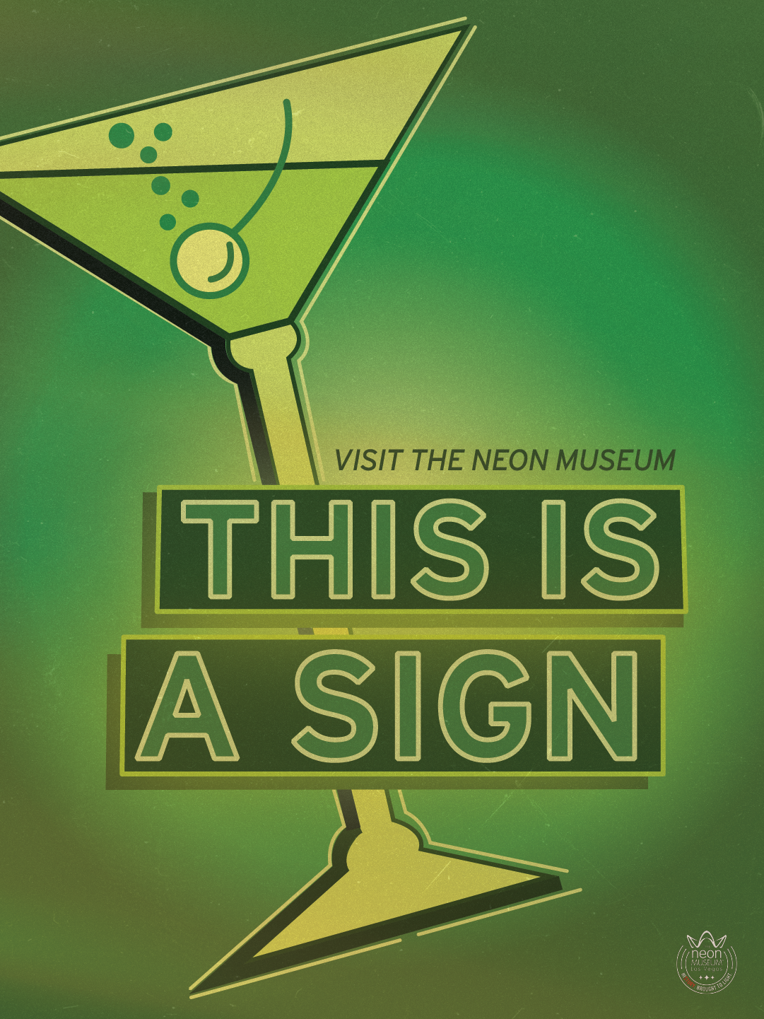
Neon Museum: This is a Sign
Poster Design
-
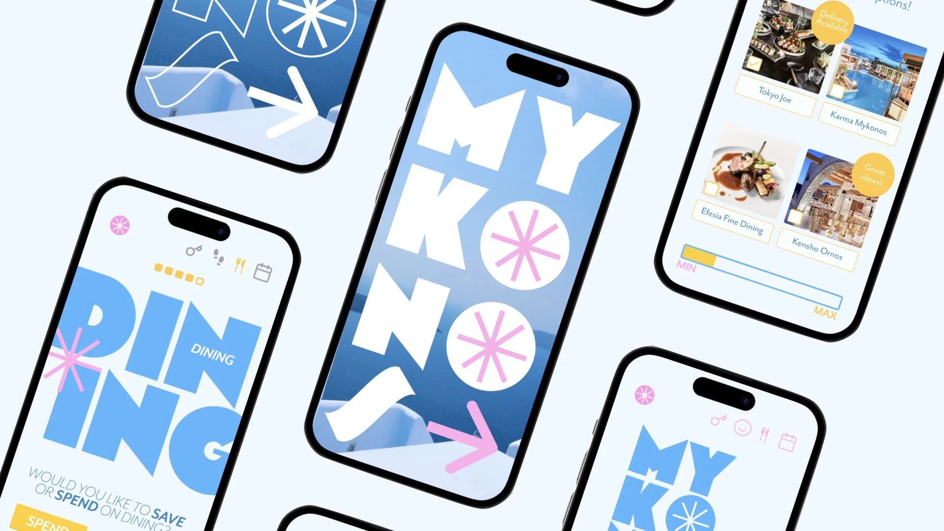
Mykonos Travel App
Mobile App Design, Figma Prototyping
-

George Lois Website
Desktop and Mobile Web Design, Figma Protoyping
-

American Dog Parents
Pamphlet Design
-

Funchal, Portugal
Logo Design
-
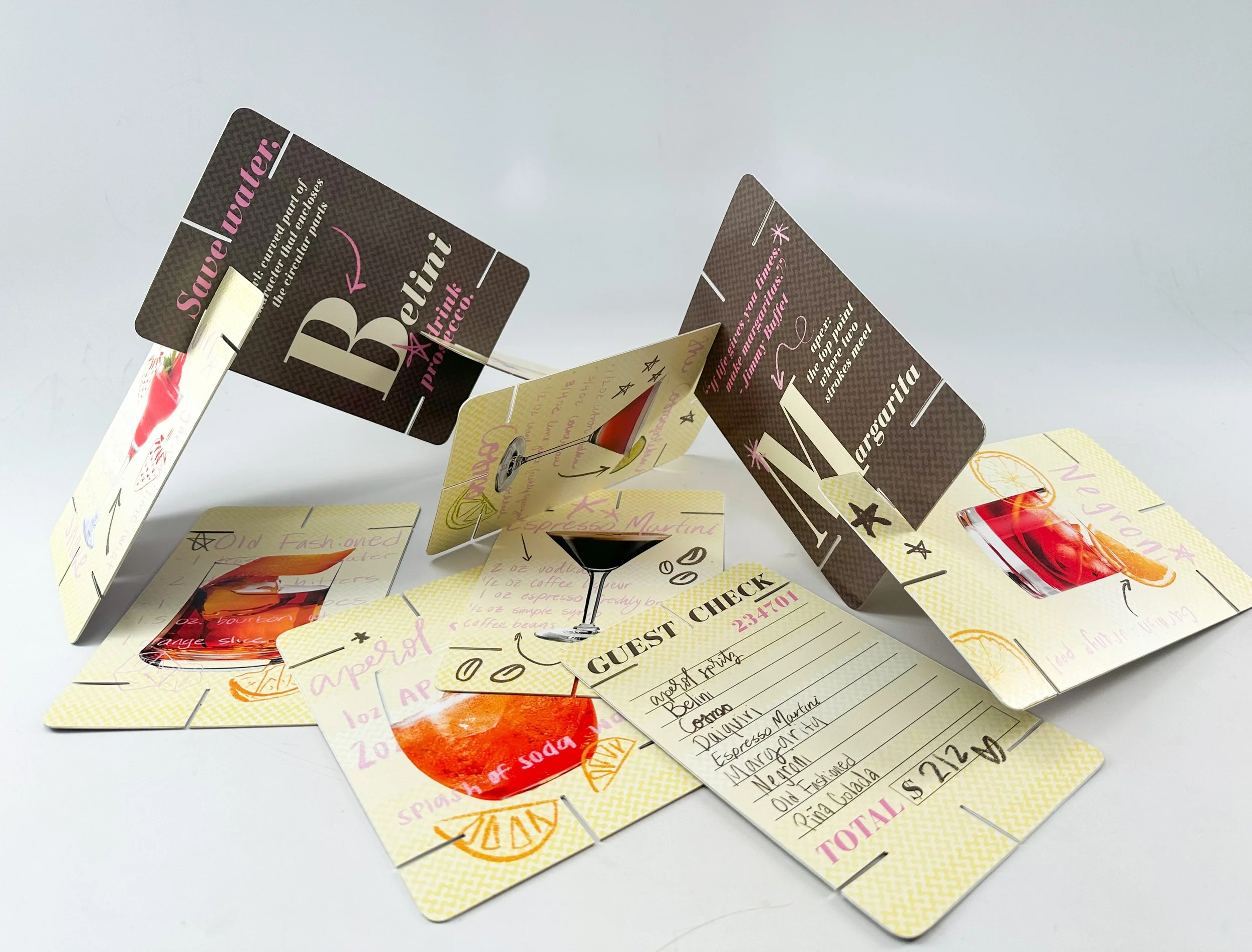
House of Cards: Cocktail Menu
Card Design